2014 Web Trends
The trends below aren’t for every site. These are simply some trends that we have seen, implemented and anticipate seeing more of in the coming year. When it comes to your website, a little creativity can go a long way. You don’t have to implement everything to make a big impact on your users. That said, here are some design trends to keep on your radar as 2014 draws near.
Single Page Websites
The typical website has dozens of links to other pages on the site with a full navigation that encourages visitors to divert from the homepage. A single page design, however, is great for smaller sites that don’t have a ton of content. Single page websites help keep your content easy to navigate while relying heavily on scrolling. The single page design technique can help convey a linear, controlled message to visitors and help keep focus on important details. This type of webpage isn’t ideal for sites with a lot of content and isn’t the best approach if search engine optimization is a focus, but if you are looking to keep things short and sweet, single page sites are a web trend worth considering.
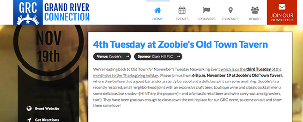
GrandRiverConnection.com features a single page design
Scrolling
As mobile devices have become more popular, small screens have forced readers to scroll more in order to read all the content on a page. This familiarity with scrolling has helped downsize the need to keep all content “above the fold,” meaning within the initial view visitors have upon loading the homepage. Visitors today are used to scrolling down a site to read more information, which can open up possibilities for the layout of your website. While a longer homepage with more design elements can help convey additional information to the reader, longer pages can also overwhelm readers if they are cluttered with content. In 2014, keep an eye out for longer, thoughtfully designed pages, and think about how you might engage website visitors by encouraging them to scroll.
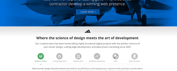
The new Web Ascender site (2014 launch) will incorporate more scrolling.
Flat UI
Flat UI, or flat user-interface, is an emerging concept in web design that is being implemented on many websites. This technique heavily focuses on content and provides a basic design with less distracting elements. Previously, website designs often centered around a skeuomorphic design with big gradients, rounded corners, drop shadows, and objects that would look and feel like real things. This technique is quickly being replaced by flat UI, which takes a much more basic approach, often with a less image-intensive design. Fewer images and simpler design elements can equate to faster load times, which helps those who will load the site on a slower connection with a mobile device. Apple’s new mobile operating system, iOS 7, Google’s Gmail, Facebook, and Windows 8 are all examples of interfaces that have implemented flat UI.

The new ASMSU website design has a flat UI.
Fixed Header Bar
Sometimes the most challenging part of creating a welcoming website is keeping the site easy for visitors to navigate. In the past, menu bars would be stuck in the header of the website, often near the logo. As you scrolled down, the navigation would disappear with the header, which forced users to scroll back to the top if they wanted to navigate further on the site. With longer webpages and mobile browsers, accessing that menu becomes more difficult. For this reason, many sites will fix the header bar to the top of the browser window, allowing it to follow visitors as they scroll down the page. Having a navigation that remains fixed to the top of the browser window lets readers quickly access the menu. While the fixed header bar does take up more visible space within the visitor’s browser, it typically improves navigation and serves as a subtle prompt for the visitor to dive deeper into the site.
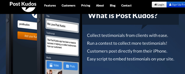
Post Kudos uses a fixed header bar to improve navigation.
LARGE TYPE
With the increased resolutions of screens over the past few years, there’s been a need to raise the standard font size of a paragraph on the web to help make text more readable and clear. With these increased screen resolutions, 12 point font isn’t as readable as it used to be. This has introduced a varying number of sizes for text, including much larger headings that are clear and concise. Large headers make a quick, immediate impact on readers and can better communicate the goal of your site. If a webpage is too verbose, a reader might choose not to take the time to read it. Large type can help make headings that interest the reader and draw them further into the text. The average reader decides within a few seconds whether a website is worth exploring, so these large headings can help grab the attention of readers and pull them into other content on the site.

Cubic's Advanced Learning Systems site features larger headers.
Flash / Silverlight / Javascript / HTML 5 Animations / CSS 3
For years, Adobe’s Flash plugin dominated video, games, and other animation on the web. It’s been a long running staple of the web that has helped push the web where the standard browser and code could not take it. In recent years, Microsoft’s Silverlight plugin helped cover much of the same ground as Flash. These plugins often have security issues, aren’t indexed by search engines well (or not at all), and tend to be very slow. Additionally, since the release of Apple’s iPhone, many mobile devices aren’t capable of running these plugins, which has helped speed the transition away from Flash and Silverlight. Both products are quickly fading into the sunset in favor of Javascript, HTML, and CSS. With modern browsers, developers no longer have to rely on plugins to develop excellent animations and deliver video. These newer technologies are often limited in older browsers, but can be done gracefully. HTML 5, CSS 3, and different Javascript techniques can help bring a website to life and create a unique browsing experience.

The new Web Ascender site (2014 launch) uses HTML 5 animations in the rotator.
Parallax Scrolling
Similar to newer animation techniques, parallax scrolling can also help bring a website to life. Parallax scrolling is a special scrolling technique where background and foreground images and text are animated as you scroll, which helps create depth and can help bring the page to “life.” As you scroll through the page, text and other graphics will become animated and move on the page to help create scenery and change content.
Examples: SoundScape and IKEA
Large Backgrounds
In the past, large background images have been hideous, would take forever to load, and make a website look horrific. These backgrounds were often more distracting and annoying than actually helpful in conveying a clear message. With faster internet connections, the time it takes to load a page is not as big of a focus as it was 5-10 years ago. Large background images are no longer an issue of loading time, but more of a question on whether the background image fits with the site. Assuming the right design and image, web designers can smoothly connect large background images into the rest of a design, actually enhancing the experience of the reader.

The new City of Albion site has a beautiful background to compliment the content.
Video Backgrounds
Alongside large image backgrounds come video backgrounds. Previously, browser limitations and concerns surrounding the speed of the page loading prevented video backgrounds from being smoothly implemented within a site. While some older browsers are still limited in this arena, new browsers can seamlessly play video that can subtly enhance and improve a site’s design. Video backgrounds aren’t designed to become the main focus of the site, but simply support the design and content.
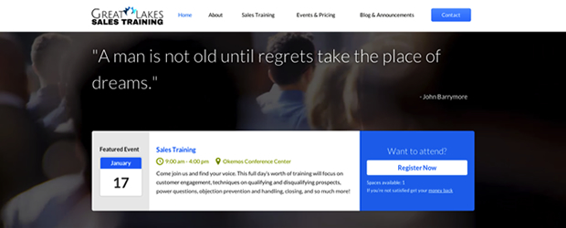
Great Lakes Sales Training has a video background
The Dying Personal Computer
Over the past 3 years, mobile internet usage has dramatically increased, often hovering around 10% of website traffic. While I don’t envision the personal computer ever going away, mobile device usage will only continue to rise. There are several key ways to make your site more mobile friendly.
Separate Mobile Site
One popular way of implementing a more mobile-friendly site is to create a completely separate website, often put on a sub-domain like http://m.webascender.com or http://mobile.webascender.com. When mobile users arrive at the site, the site detects that they are on a mobile device and then redirects them to the mobile site designed just for their device. This can be beneficial if you want a completely different design and set of content for mobile users. However, this separate site often means that two individual sets of content must be maintained, one for the mobile site and one for the regular site. Newer technologies have helped make this option obsolete in favor of more seamless a integration of responsive web design.
Examples: ESPN and the Detroit Free Press
Responsive Web Design
Creating a responsive web design is now the best way to implement a mobile site. Instead of having to deal with a completely separate set of content and a new design, you can utilize existing content that responds to the resolution of the device you’re using. Mobile, tablet, and desktop users can all see the same content with a different layout that has been designed specifically for their screen size and device. A second set of content isn’t necessary with a responsive web design because it will format your website content to work seamlessly with mobile browsers. Within a responsive design, you can emphasize content important to mobile visitors, such as hours, locations, or a phone number. Envisioning what mobile readers may want to see can help make your mobile site unique and particularly handy. This technique has been very helpful in making maintaining mobile sites simple; instead of having to constantly modify a second set of content, a responsive design will integrate with your existing content to provide a smooth browsing experience for your mobile visitors.
Example: This page! Take the corners of your web browser and shrink the width of the screen to simulate what tablets and other mobile devices will see. You must be in a modern web browser to see it (Chrome, Firefox, Safari, IE 9+).
High-Resolution Screens
Since the adaptation of Apple’s Retina screens within their iPad, iPhone, and MacBook products, we’ve seen the need to have high resolution graphics incorporated into websites. Just like standard definition television has been overtaken in recent years by high-def signal, high-resolution screens will soon become a staple on computers and mobile devices. These high-resolution screens do a great job of making websites look phenomenal, but require higher resolution images in order to reduce the pixelation that often occurs within websites. Currently, Apple’s Retina MacBooks show the most significant difference in images, which represents a very small piece of internet traffic, so implementation of this technique isn’t vital immediately, but will be important to keep in mind in for 2014!

The existing Web Ascender site does not have high definition graphics, but we're working on it! You can see an example in the graphic above, where the logo and rotator aren't extremely crisp. This is what browsing this site would be like on a retina display.
Third-Party Services
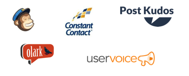
We often have clients come to us with big ideas that they want solutions for. Instead of reinventing the wheel each time, we can rely on third-party services who have already solved the problem for us. If someone wants to post real-time status updates on their website from their mobile device, we can rely on Twitter or Facebook to do that by establishing a feed on the website that pulls from these services to display the updates. If a website administrator wants to post real-time photos from an event, we can integrate Instagram or Flickr to pull from that organization’s feed, which will automatically update the website. Third-party services can also come in handy to show video on a website, implement a newsletter system, or collect stats on visitors to a site. Using third-party services can give your site access to fantastic, robust software that can solve many hopes and dreams.

Some of our favorite third-party services.
Software as a Service (SaaS)
Along the same lines as third-party services, software as a service allows us to integrate with a service that’s already been developed in order to solve a problem. Typically, these services are free up to a certain amount of usage and then they charge for additional use or more features. MailChimp, for example, is a free newsletter system up to 2,000 subscribers and 12,000 emails. If you want to send more emails a month, you have to sign up for their monthly service. While there’s often a small monthly fee, the initial cost heavily outweighs the cost of building your own service and reinventing the wheel. Post Kudos is another example of software as a service. Post Kudos allows websites to collect and display testimonials on a website automatically. Testimonials can also be submitted through a mobile app, which makes it convenient for customers who own a mobile device. Post Kudos is free up to 10 “kudos” but allows upgrades that could expand an account to upload up to 300 "kudos."
Examples of our favorite SaaS sites.
Open Source Software
We love open source software. This type of software allows developers, like myself, to access the code used to build the piece of software. This openness helps create a community that can help support and improve the product’s features and fix different bugs found. Open source software helps us build and implement huge features faster than ever because a whole community has helped develop technology that solves common problems. Many websites we create rely on some sort of content management system in order to add, update, and maintain the content on the site. These content management systems are often open source platforms that have a large community continually adding new features, fixing any bugs, and creating additional plugins to enhance the system. We don’t have to reinvent the wheel with each site we create, but can rely on these robust systems to make life easier to administer the website.
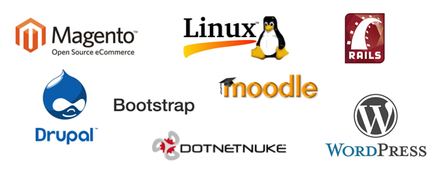
Examples of some of our favorite open source software.
So...what can I do?
Design Update
If you want your website to stay fresh and on the edge of the latest trends, we suggest updating your website’s design and layout every 2-3 years. While small tweaks are often necessary for different marketing ideas, we don’t think it’s always necessary to update every year, even though it can help maintain a fresh look. If a website is on a content management system, implementing a design update is often easier than re-creating the website because we can rely on existing content without the need to start over. Web Ascender completes a major upgrade to our website every two years as well in order to stay on pace with the latest trends. A design update can enhance an organization's brand and improve a visitor’s mindset related to the organization.
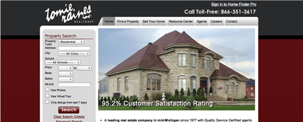
Tomie Raines - Before

Tomie Raines - After

Michigan Dental Association - Before

Michigan Dental Association - After
Start / Revive Your Newsletter
We’ve seen newsletters help drive customers back to websites by focusing on new content and fresh ideas. When a newsletter is sent out, it can increase website traffic 2-3 times its normal daily average. This increase can be a huge help for continually selling your brand and your website, opening clients to new ideas about your organization in an informative way. Many readers are happy to hear about a new product, what you’re doing in the community, or how your organization can be helpful, otherwise they wouldn’t be signed up to hear from you!
Add New Content / Start a Blog
New content is one of the best ways to keep your website up to date and relevant to visitors. Readers don’t want to visit a site that doesn’t have updated content. If your site content hasn’t been updated or changed within the last month, you should think about doing a blog. Not only is this good for search engine optimization purposes, but it also gives your client-base a reason to continue to return to your site. You know you’re a professional in your field, but blog about it to help win over your readers.
Add Share Buttons
Share buttons are great for news articles and events, allowing visitors to share content on your site with their Facebook friends, Twitter followers, and other avenues of social media. Share buttons allow your visitors to essentially market your content to their social spheres...and you don’t have to lift a finger! This helps drive traffic to your site and get your message in front of others.
Get Started on Social Media
Along with adding share buttons and starting a newsletter, social media can help expand your audience and message. Sending out content with your organization’s Facebook, Twitter or Instagram accounts can help place your brand in front of your followers and help you create new ones. Social media also helps make it simple for your followers to interact with your organization and share your organization’s posts with their followers...free marketing! It’s a beautiful thing!
Finally...
This is a landslide of information, which can be confusing if you don’t deal with websites everyday like we do. We love helping improve websites, so if you’re looking to implement some of these ideas or want to know how these trends can directly benefit your website, contact us!
출처 : http://www.webascender.com/Blog/ID/449/14-Website-Trends-for-2014
'Story > html/css' 카테고리의 다른 글
| ie11 frame history 문제 (0) | 2014.01.14 |
|---|---|
| 홈페이지제작시 특정 input 속성에만 스타일을 지정할때 Styling Texty Inputs Only (0) | 2013.12.11 |
| Quirks mode (0) | 2013.08.28 |
| X-UA-Compatible Meta Tag (0) | 2013.08.28 |
| 유튜브(youtube) 동영상 레이어 겹칠때 뚤리는 현상 해결방법 or z-index 문제 (0) | 2013.08.22 |